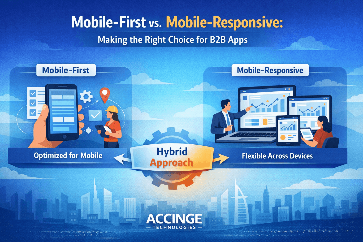
Mobile-First vs. Mobile-Responsive: Making the Right Choice for B2B Apps
Mobile-First vs. Mobile-Responsive: Making the Right Choice for B2B Apps
In today’s fast-paced digital world, mobile devices are no longer optional—they’re essential. For B2B applications, where efficiency and usability directly impact business outcomes, choosing the right mobile strategy can make a significant difference.
Two common approaches dominate the conversation: Mobile-First and Mobile-Responsive design. While they may sound similar, they serve different purposes and can lead to very different user experiences.
At Accinge Technologies, we help businesses choose and implement the right approach based on their goals, users, and scalability needs.
Understanding Mobile-First Design
Mobile-first design means building the application starting from the smallest screen (mobile) and then scaling up for tablets and desktops.
Key Characteristics:
- Designed primarily for mobile users
- Focus on core features first
- Faster load times and performance
- Simplified and clean UI
When Mobile-First Works Best:
- Your users are mostly on mobile devices
- You need high performance and speed
- Your app requires quick, on-the-go interactions
Understanding Mobile-Responsive Design
Mobile-responsive design means creating a single application that adapts to all screen sizes—desktop, tablet, and mobile.
Key Characteristics:
- Flexible layouts and grids
- Same features across devices
- Adapts UI based on screen size
- Easier to maintain one codebase
When Mobile-Responsive Works Best:
- Users access the app across multiple devices
- Complex workflows require larger screens
- You want consistency across platforms
What Works Better for B2B Applications?
There is no one-size-fits-all answer. It depends on how your users interact with your application.
Choose Mobile-First if:
- Your workforce is field-based (sales, logistics, service teams)
- Speed and accessibility are critical
- You want a lightweight and efficient experience
Choose Mobile-Responsive if:
- Your application involves complex dashboards
- Users switch between desktop and mobile
- Detailed data visualization is required
The Smart Approach: Hybrid Strategy
In many modern B2B applications, the best solution is a hybrid approach:
- Use mobile-first principles for core workflows
- Apply responsive design for advanced features and dashboards
This ensures both performance and flexibility—without compromising user experience.
How Accinge Technologies Helps
At Accinge Technologies, we design and develop B2B applications that are:
- Scalable across devices
- Performance-optimized
- User-centric and intuitive
- Built with modern frameworks
We analyze your business needs and user behavior to recommend the right mobile strategy—whether mobile-first, responsive, or a hybrid model.
🔗 Explore our services:
👉 Accinge Services
🔗 Discover more insights on technology and development:
👉 Accinge Blogs
Final Thoughts
Choosing between mobile-first and mobile-responsive is not just a design decision—it’s a business decision.
The right choice can improve productivity, enhance user satisfaction, and drive better results for your organization.
In the end, the goal is simple:
Deliver a seamless experience—anytime, anywhere, on any device.
“Design is not just how it looks—it’s how it works across every screen your users rely on.”


